Cachaça 51
Cachaça 51 is one of the Brazilians favorite beverages for making up the famous Caipirinha drink.
It's also one of the largest beverage brands in Brazil and exported to over 50 countries. cachaca51.com.br
The Challenge
To modernize the current Cachaça 51 website for Brazil's audience, with the main goal being to change the
national misconception that cheaper beverage means no quality.
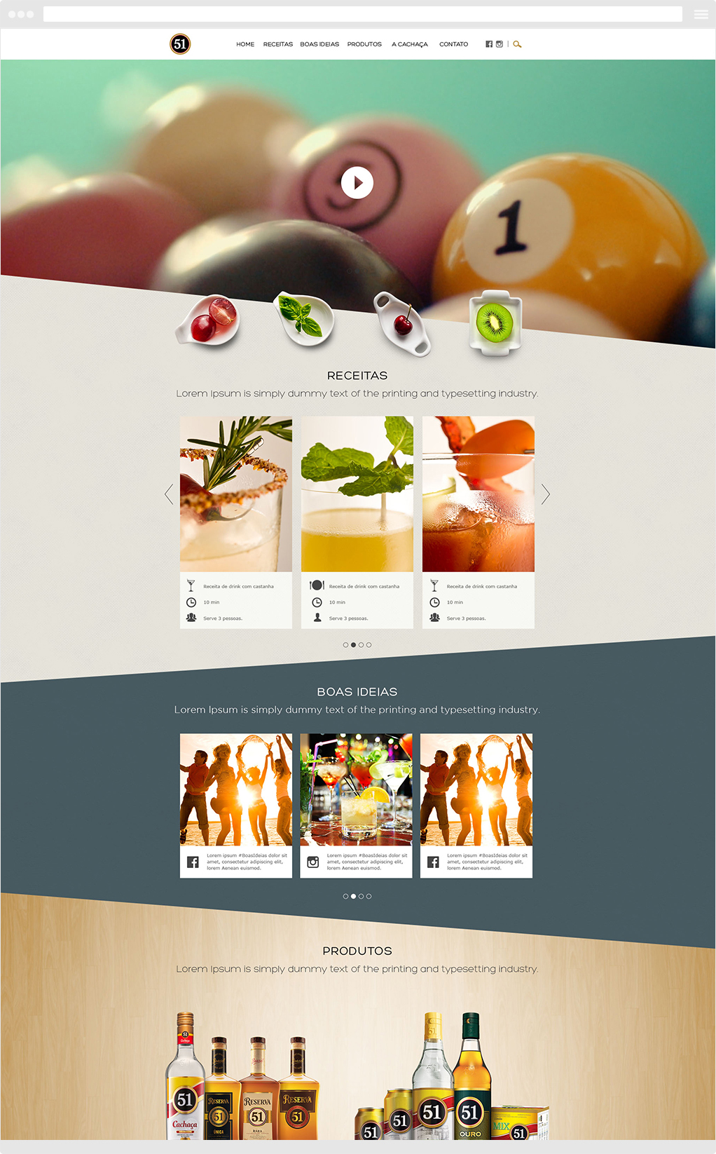
So, everything goes around uplifting the image of cachaça into the minds of its consumers. From the start the idea was to redo the website altogether and make it more like a product showcase, but also with a modern and refreshed approach.
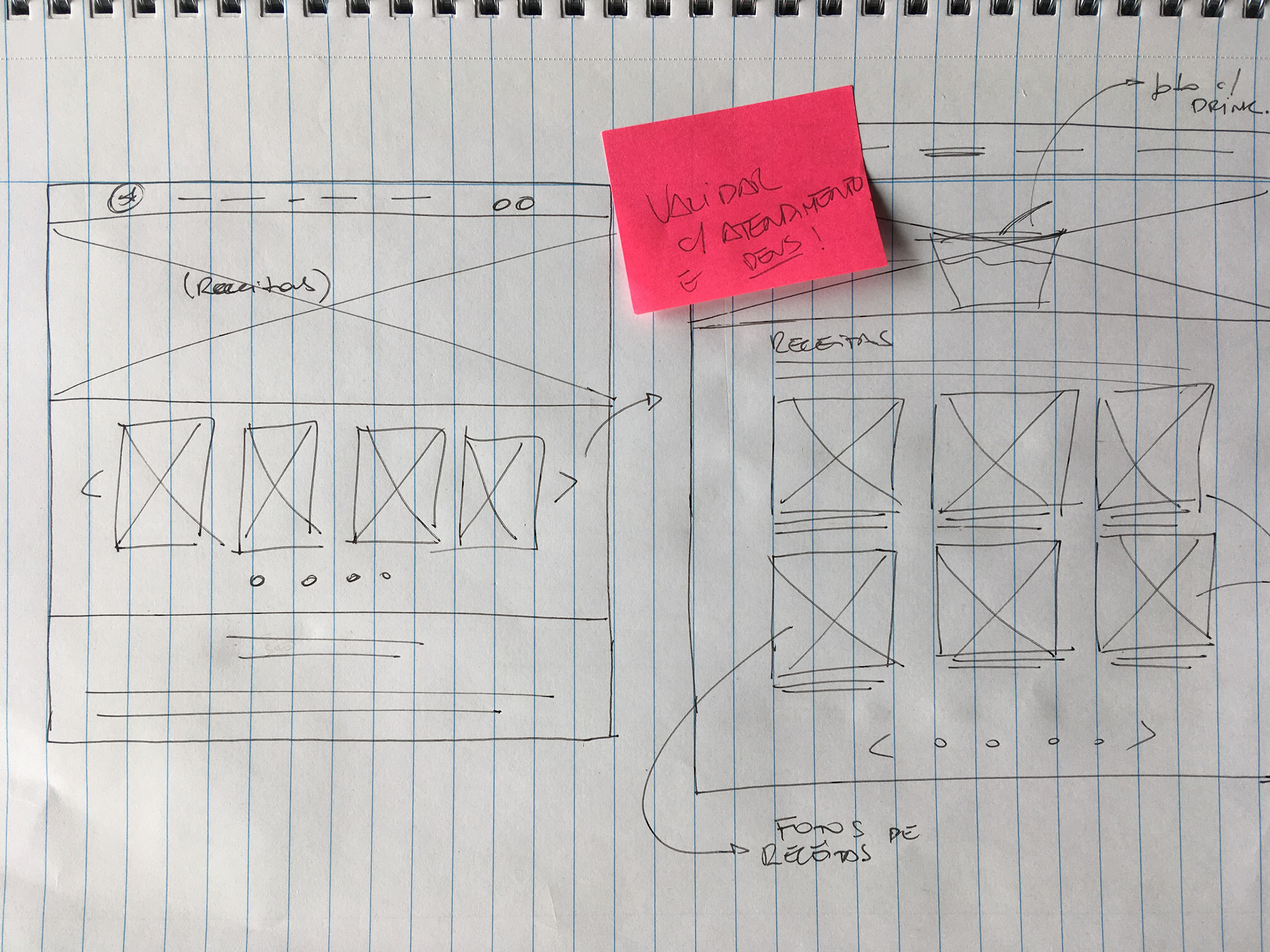
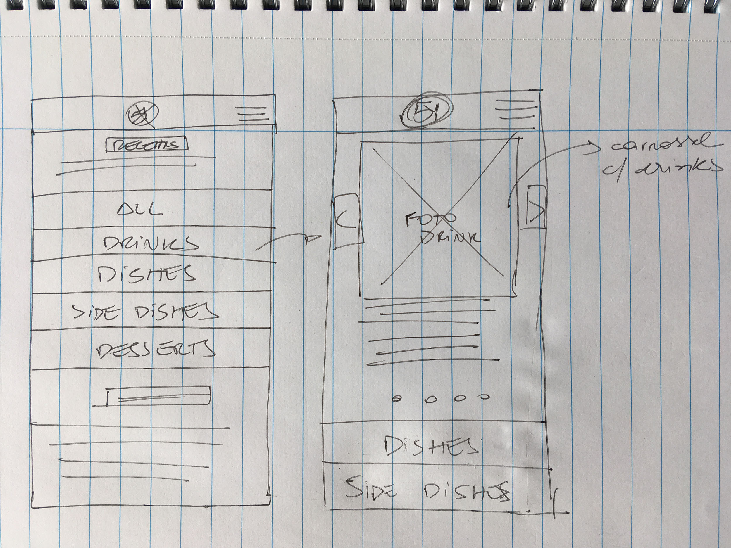
Defining the MVP
We wanted to increase the product sales in-store by changing the user's perception that a cheap product is not worth buying.
To accomplish that, we had to realign the expectations of the stakeholders and the client regarding their branding campaigns. We compared with competitors products to understand and investigate their current offerings in the market, and we also gathered inspiration from other brands perspective.
After collecting all these inputs and having more data on our competitors, we could identify the following key needs for the MVP:
Understanding the problem: Accept the fact that users see the brand as cheap and act on it.
New label, same product: We wanted to make it clear to the customers that, although we are introducing a new website with a fresh approach, the product and taste will remain the same.
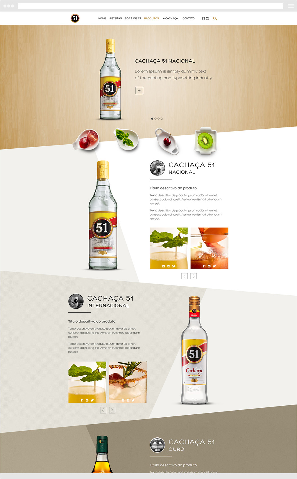
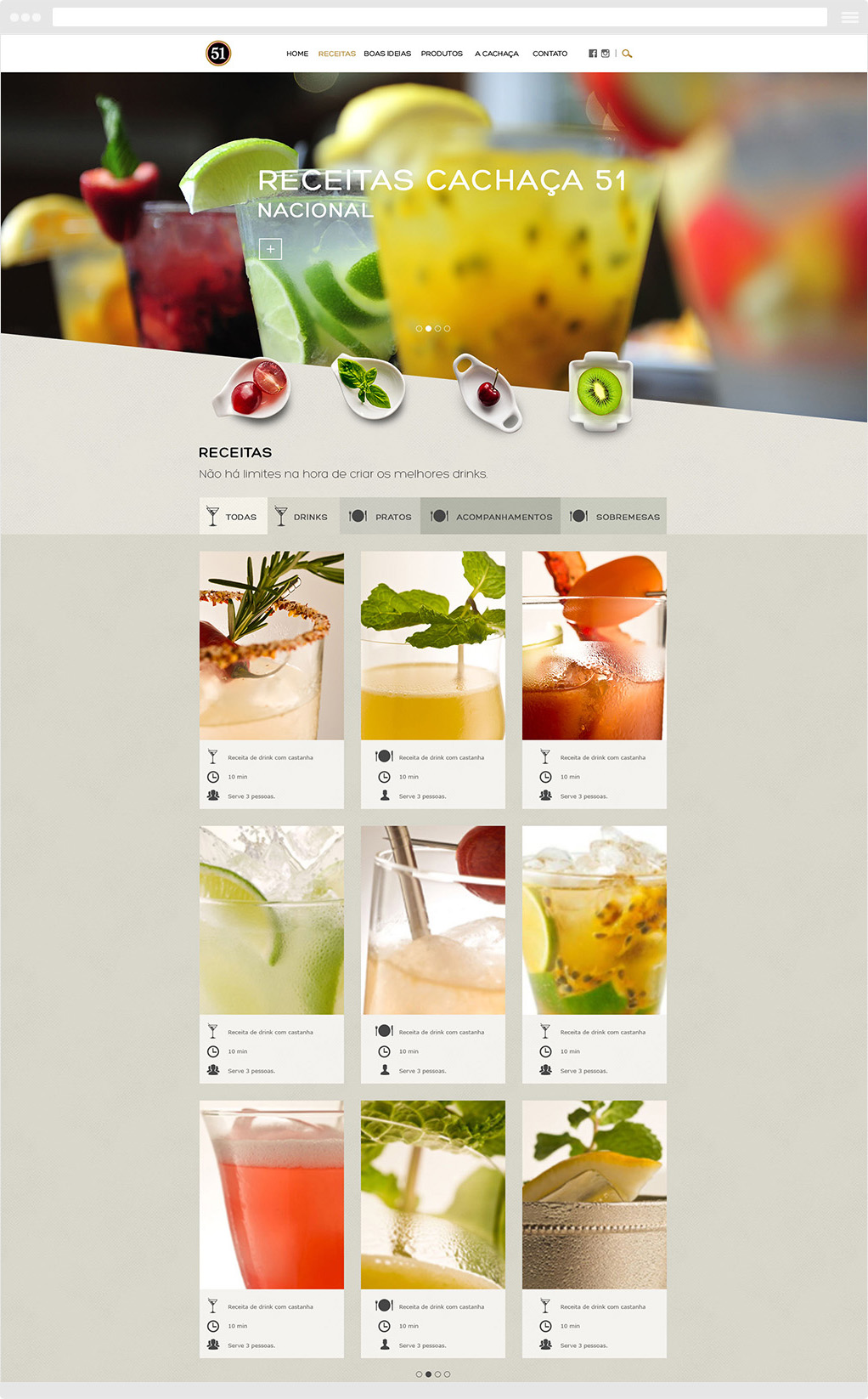
Product showcase: The website should look and feel way more attractive than the previous one. To accomplish that, we knew we needed to build a website that gave users a mouth-watering feeling as they hovered over the website.
My role
UX/UI Designer and Prototypes
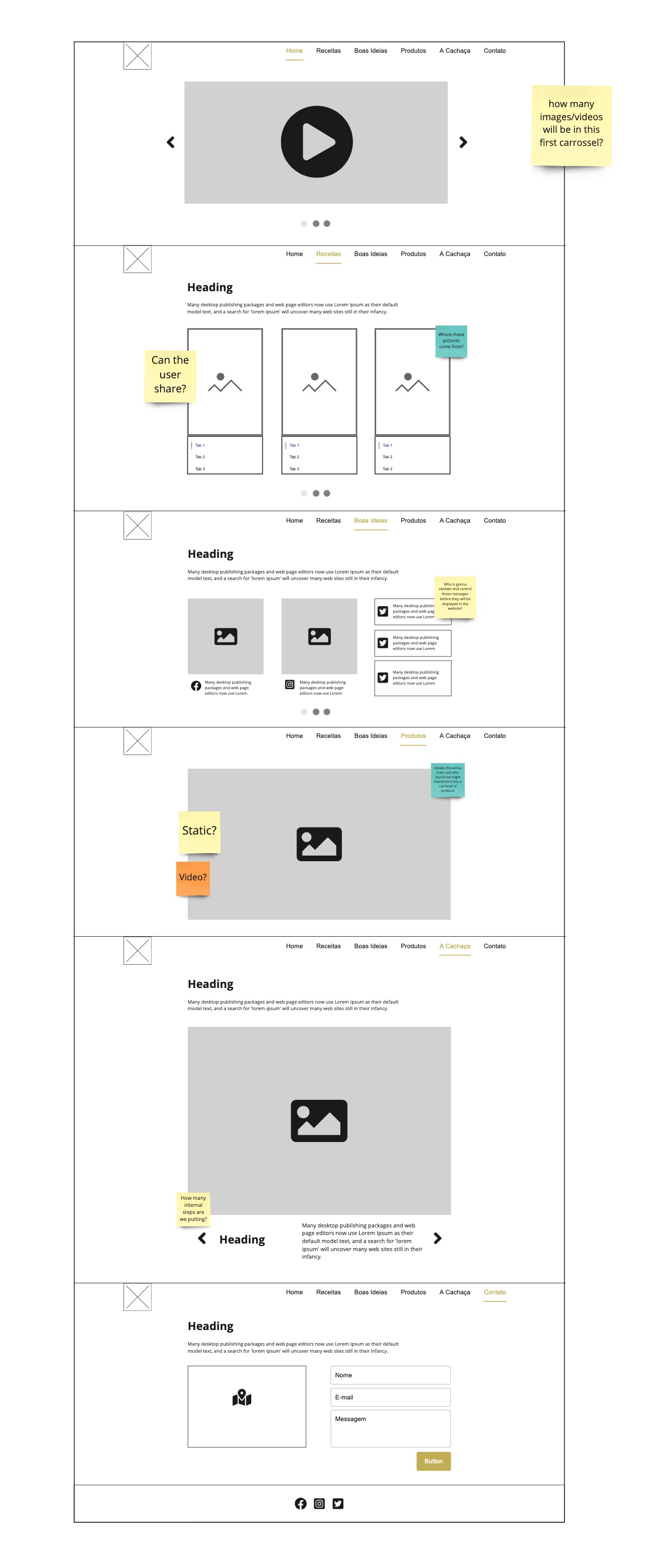
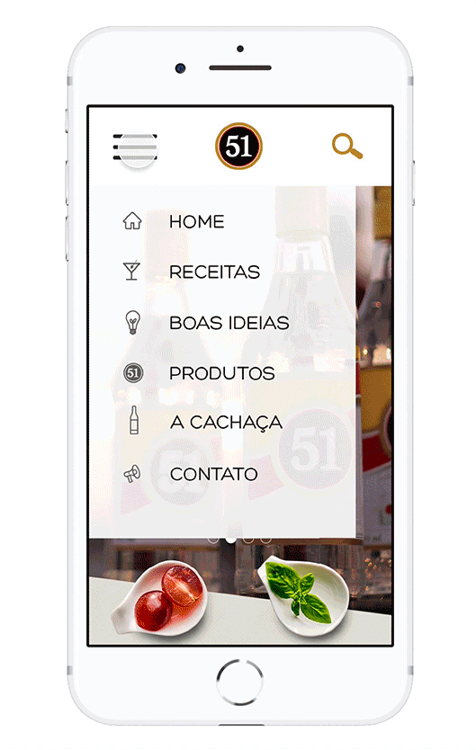
After carefully analyzing competitors research and gathering all inputs from stakeholders, I decided to build a more visual-driven website, not only to entice users visually, but also to create their willingness to share the content on social media.
I also wanted a website that had a simple structure that conveyed our purpose and value to users.
The major challenge was to combine UI with the Front-end and translate it as
a functional, mobile-friendly, and beautiful platform.
Results and takeaways
Even though working closely with the client can be very intense, it can also be very effective once everyone is aligned and expectations are well communicated. The whole experience taught me a lot about being transparent and knowing when and where to focus my energy and efforts.
Some key takeaways from this experience were:
Expectations x reality: Expectations for projects that involve changing the brand perception in the head of consumers, can be overwhelming but clear communication is key to keep those expectations aligned.
Focus on rebuilding: Rebuilding a website is very different from rebranding. And that was our main focus all along that kept us going in the right direction.
Beauty as bait: Oh yeah! The previous website was utterly unattractive and very outdated, so we would need to combine lush beauty with great functionality to achieve the main goal of rebuilding the website.